App makers · Screenshot review
App Store screenshots rejected? Audit each device set before redesigning
For a screenshot rejection under 2.3.3, count images that show the app in use within each device and language set. A four-image example shows why two useful screens are not a majority.
GimmeTheSauce editorial ·
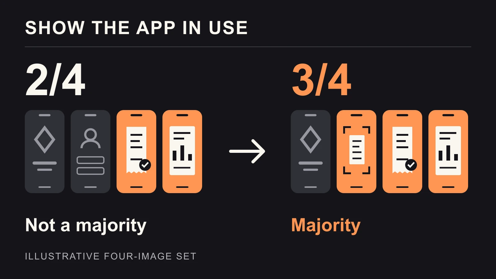
If Apple cites screenshot guideline 2.3.3, inspect the submitted set before redesigning every image. Apple's current guidance requires more than half of the screenshots for each supported device to show the app in use; it also assesses each localization. Two app screens in a set of four do not meet that majority. Start with the exact rejection message: another guideline may require a different fix. Apple's screenshot guidance
Inventory what was actually submitted
Open the version and language Apple reviewed. Write one row per image: its position, device set, visible task and any marketing claim. Use the uploaded files, not the latest design-board export. A corrected English phone set cannot tell you what remains in a French tablet set.
Here is an original hypothetical example for an expense app, with four images in one phone-and-language set:
| Image | What a reviewer sees | Our app-in-use count |
|---|---|---|
| 1 | A full-page brand slogan with no interface | No |
| 2 | The generic sign-in form | No |
| 3 | A receipt being categorized in the app | Yes |
| 4 | A completed report in the export preview | Yes |
This inventory gives 2/4 = 50%. Replace image 2 with the actual receipt-capture feature and the count becomes 3/4 = 75%. For this example, one targeted replacement is enough to clear the numerical check. It does not establish that the claims, purchases or remaining assets comply.
Count a visible task, not a phone-shaped decoration
A tiny interface behind a large slogan is not a reliable way to demonstrate functionality. Apple allows explanatory overlays, but says they must not obscure the main functionality. Keep the important action and result readable. A real categorization screen is more useful here than a decorative phone frame containing a logo. Apple's examples and overlay guidance
For each image you count, complete a practical check: “The user is doing ___, and I can reach this state in the submitted build by ___.” Have a teammate reproduce that state. If the paid export is unreachable with the review account, rehearse the complete review path before polishing its screenshot.
Bring the inventory and exact message to the Apple App Review AI mentor ↗ to challenge your classification. Keep account credentials and customer data out of the conversation.
Check the promise and the placement separately
Suppose image 4 says “Export every report” while exporting requires an additional subscription purchase. Make that requirement clear in the featured asset; Apple's 2.3.2 addresses purchase disclosure. Use fictional account information, as required by 2.3.9; synthetic receipts also keep customer data out of captures. A majority of interface images does not fix misleading copy or exposed customer information. App Review Guidelines, section 2.3
Also distinguish screenshots from creative assets for product-page headers and search placements. Apple's October 2026 announcement describes these as additions to screenshots and previews. A brand illustration designed for a header should not be assumed to serve the same purpose in a screenshot set. Apple's asset announcement
Before resubmitting, use App Store Connect's preview to inspect the relevant device, orientation and language. Check scaled variants too: Apple's asset-management guide notes that deleting an image also removes it from display sizes using that scaled version. Record the exact replacements so your review response can name what changed. Manage App Store assets
After the review issue is resolved, test acquisition changes separately. If downloads move, check the traffic mix before crediting the new screenshots. Passing a screenshot check and improving conversion are different outcomes.
After the set passes review, you can test which eligible screenshot should come first. Interpret the lift and confidence reported for a screenshot treatment before replacing the original. Passing the asset check and improving download conversion are different outcomes.